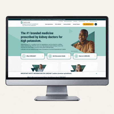
The Lokelma DTC patient website needed an update to make it easier to use and help patients and caregivers find information faster. As the main agency for Lokelma, we planned the update in phases. The goal was a cleaner, simpler, and user-friendly website. As art director, I led the design along with the UX team, to give the site a fresh look while keeping the Lokelma brand style. We added new photos, icons, colors, and graphics across the site. The three phases launched in parts and were fully live by May 29, 2025.
Check out the Phases below.
Phase 1: We audited the website and identified key areas for improvement. We quickly improved accessibility by adjusting the color palette, removing extra CTAs, and making important CTAs easier to find. This raised the site's click-through rate from under 1% to 3% in the first month.
Phase 2: We refined the CTAs to be clearer and highlighted key items like surveys, signups, starter kit downloads, and savings downloads. The design and UX teams reorganized the information and created new CRM emails supporting these CTAs. This led to a 113% increase in signups, 283% more savings downloads, and 292% more Starter Kit orders.
Phase 3: We refreshed the website’s look by updating graphics, campaign images, and page layouts, working closely with the UX team to enhance the design.
View the LOKELMA Case Study
The site before:
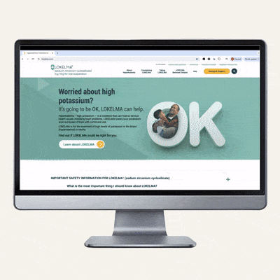
The site after: