Every year Amgen hosts a week long event called, Mission Week - filled with events, lectures, and activities for employees and Amgen patients.
This year, 2025, Imre took on a bigger role. We were tasked with developing the branding and theme for the year. Throughout a 9 month porcess, we developed the logo, brand guidelines, theme elements, installations, and over 45+ digital and print assets for 3 site locations - Thousand Oaks, California, Breda, The Netherlands, and Singapore.
As a Sr. Art Director on the account, I aided in development of main assets and oversaw and and guided designs through print, animation, and final phases. I assisted in creating the Logo, the print assets, storyboards for digital animations, and installation designs, and then on site helped co-ordinate filming. I worked closely with the studios teams ensuring the brand guidelines and brand elements were being used correctly in every instance. I worked hand-in-hand with the Managing Art Director, copy supervisor and client experience team, clients, and project managers throughout the entire duration.
Theme reveal: This was the video the introduced the year logo and theme to the company. I assisted in developing the flow, storyboards, feel, and the logo animation.
Brand Guidelines: Consisted of logo breakdown, Typography, Color palette and the graphic elements that pull the theme together and how they work within our presentations, photography and digital assets. Assisted in creating the guideline rules, the asset examples (How to use the elements and presentation designs)
The Logo: The logo contained 3 main sections. 1. The 2025 Mission Week Wordmark, was based off of the theme for the year. 2. The “O” Camera Icon, was the graphic element that we used throughout out photography assets. The bracket elements and “O” symbolizes the camera aspect of capturing the moments. 3. The “MW” icon stamp, was created to symbolize the evergreen Mission Week event, that happens every year.
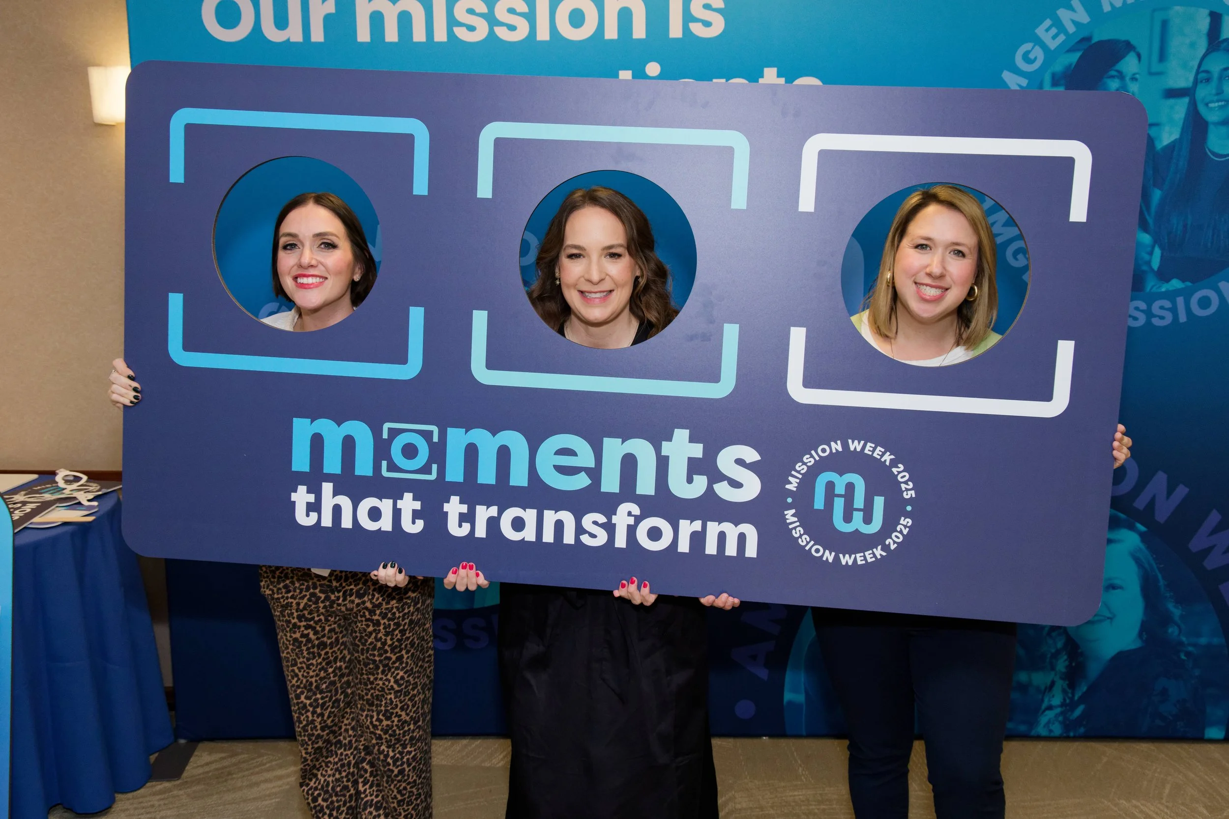
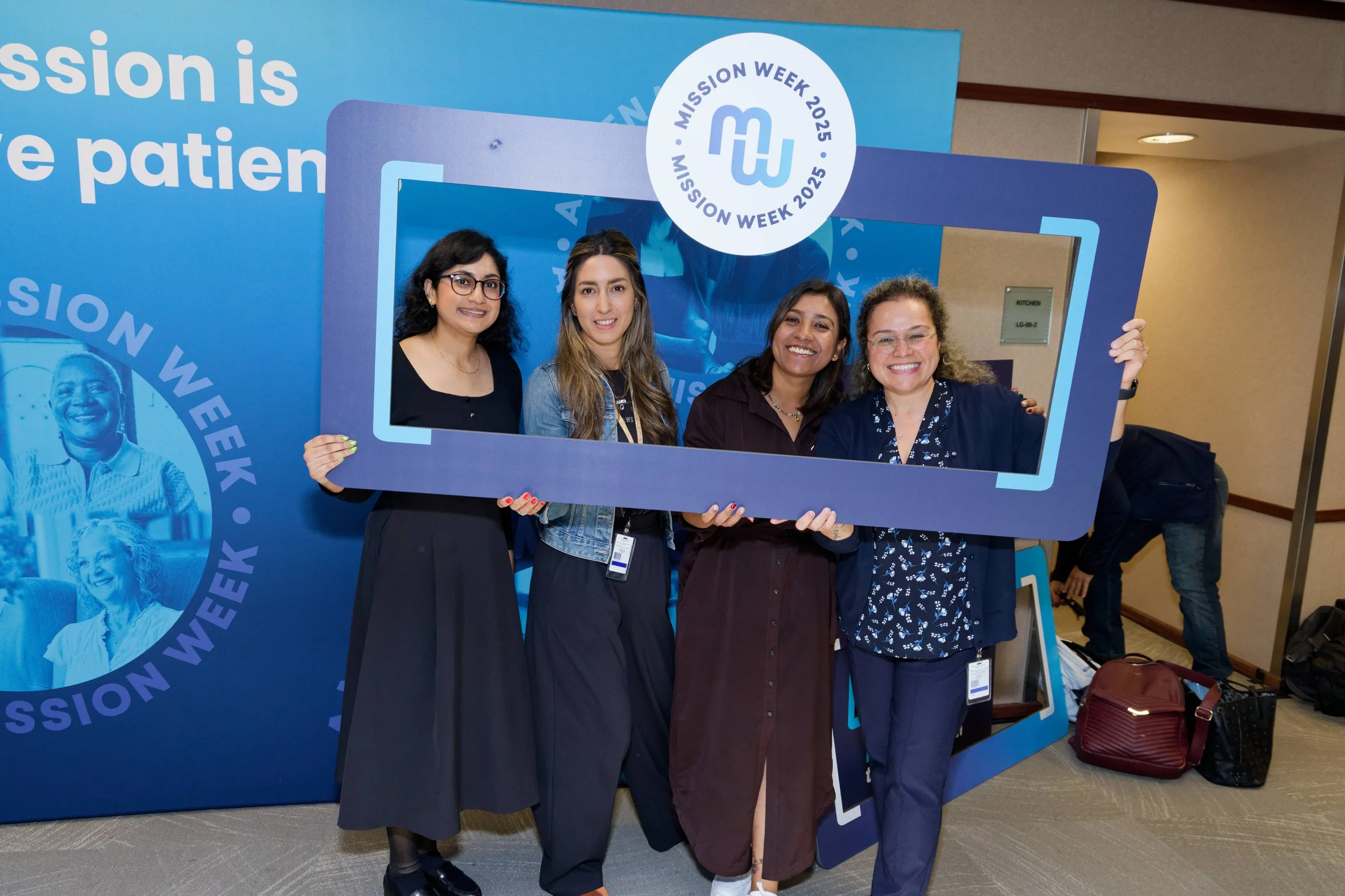
The Bracket Element: The bracket element was used to memic the concept of capturing and preserving unique and powerful moments. We used this element, in the logo and in our photography around people and moments. We also developed Photo frames, for each site, that people were able to use - that utilized the bracket element.
Print and Digital Assets: We developed over 45+ print and digital assets, that spanned across 3 live on site locations: Singapore, California, The Netherlands. Print assets consisted of; PhotoBackdrops, Pull Banners, Welcome Banners, Outdoor Feather Banners, Stage Backdrops, Auditorium Banners, Balcony Banners, Mosiac Wall.


